February 2010 2 posts
Static classes in C# and Java
Sunday, February 28, 2010
While C# and Java are similar enough that one can often copy/paste code from one to the other with minor changes, sometimes the subtle differences will get you...
Both languages allow you to declare a class as static. They mean very different things, however.
In C#, a static class is pretty straightforward: it is a class with all static members. You can't instantiate a static class.
In Java, it's more complicated. A class can only be marked static if it is an inner class and not anonymous. It is a compile-time error to mark a top-level class as static, e.g. you can't create Hello.java with this as the content:
/* Java */
public static class Hello { /* ... */ }
If an inner class is not declared static, then it can only be instantiated within the context of its enclosing class:
/* Java */
public class Hello {
    public class Inner {}

    public static void main(String[] args) {
        new Inner(); // compile-time error because there is no enclosing instance of Hello
        new Hello().new Inner(); // ok
        new Hello().createInner(); // ok
    }

    public void createInner() {
        new Inner();
    }
}
If an inner class is declared static, then it behaves as if it was declared as a top-level class:
/* Java */
public class Hello {
    public static class Inner {}

    public static void main(String[] args) {
        new Inner(); // ok
        new Hello().new Inner(); // can't do this with static class
        new Hello().createInner(); // ok
    }

    public void createInner() {
        new Inner();
    }
}
In C#, there is no equivalent of enclosing instances or non-static inner classes. Inner classes behave the same as top-level classes:
/* C# */
public class Hello {
    public class Inner {} // equivalent to declaring as static in Java
}
Windows Mobile PIN unlock is braindead
Monday, February 8, 2010
My phone has a screen saver PIN lock because the Exchange server enforces this for phones that receive company mail. There are many things broken with this:
- I set the screen saver timeout to 15 minutes, but it seems to lock itself after 5 minutes sometimes, which is very annoying.
- There is no way to disable the PIN lock once Exchange enables it. Even if I delete all traces of my emails and email accounts, the setting to disable the PIN lock is grayed out.
- There is a choice of password or "simple PIN." I chose password at first, but it made me use a letter, number, symbol, blah blah and had to be 8 characters or something. I hate typing those on a phone, especially if I have to do it every time I put the phone down for 5 minutes. So I'm using the PIN and it's 0000. My coworkers seem to prefer 1111 and 1234.
- If the phone runs out of batteries on the PIN screen, it thinks you're trying to hack it, and makes you type "a1b2c3." Sounds easy, but the hardware keyboard does not type numbers in this mode! Using the on-screen keyboard, it's a total of 13 screen taps, plus waiting for the keyboard to switch between numbers/letters mode after 5 of those taps. This situation actually happens a lot since the phone boots into this screen, and if you turn it on while it's low on batteries, it will die on that screen.
- There are more...
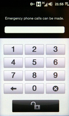
Anyway, on the left is what it looks like when the screen saver is deactivated. Notice how this screen is quite simple and allows the entry of the ten digits, backspace, cancel, and enter.
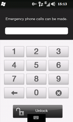
On the right is what happens when the phone, in its unlocked state, is connected via USB to a computer that is not its ActiveSync partner. This screen shows even if the phone was just unlocked (via the left screen) 5 seconds before plugging it in. Notice how it's retarded.
(The difference in coloration is due to the fact that the one on the left is a photo while the one on the right is a screenshot. When it's in screen saver mode I can't seem to get a screenshot so I had to settle for a photo.)


Here's what's wrong with the screen on the right:
- Why is there a start button in the top left? It's not like you can do anything.
- Why does the unlock button have text on it, while the other one didn't?
- The icon in the bottom center looking out of place is the button that opens the on-screen keyboard. Why does it exist on this screen? Clearly the phone knows my PIN is all digits, as evidenced by the big digit buttons. Why provide a full keyboard and make the screen ugly in the process?
- Actually, why is this screen different at all than the other one? Why are there two different pieces of code for the same functionality?
I love how I can make an entire rant about a screen that has exactly one purpose.
